Project Overview
About the Client / My Role
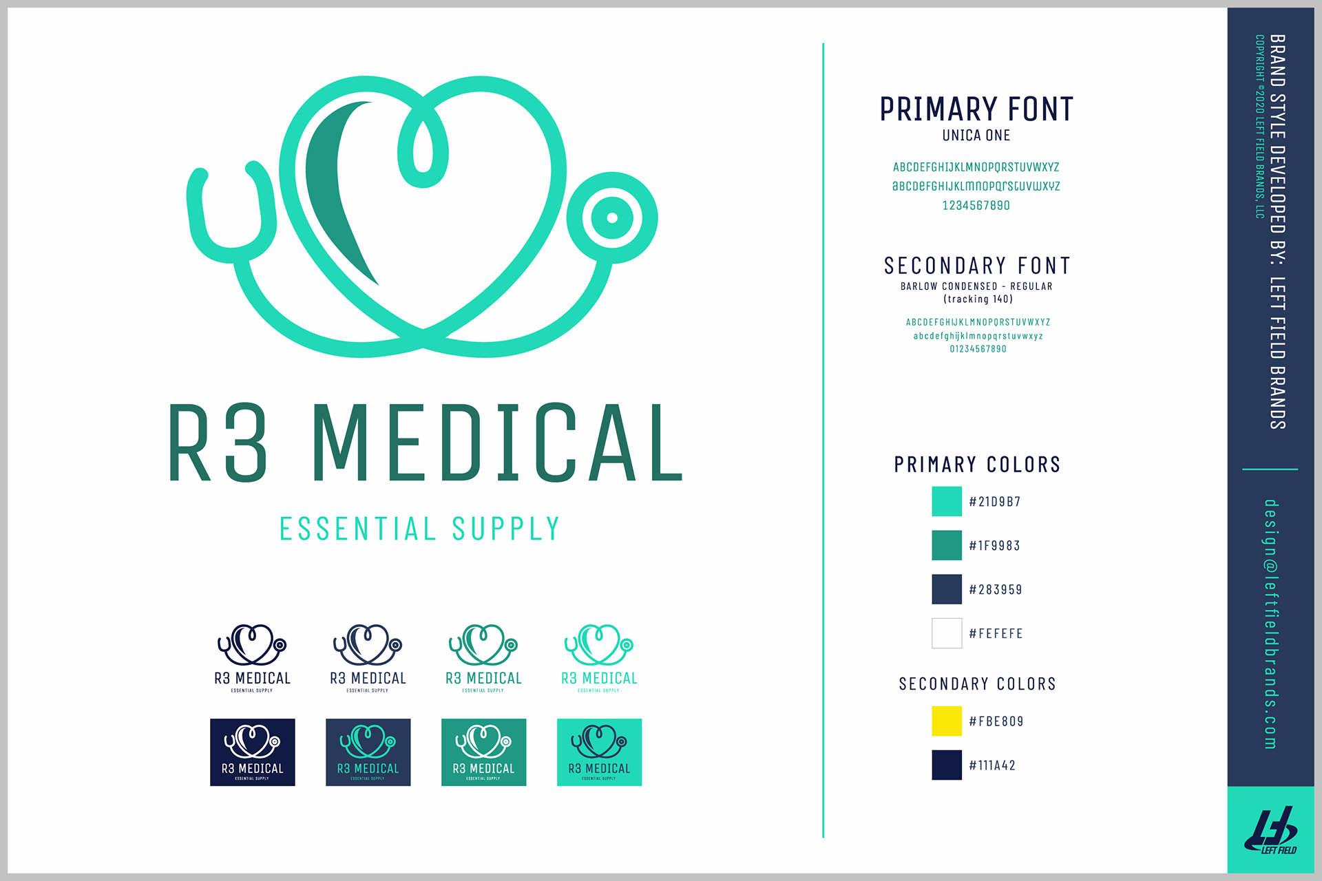
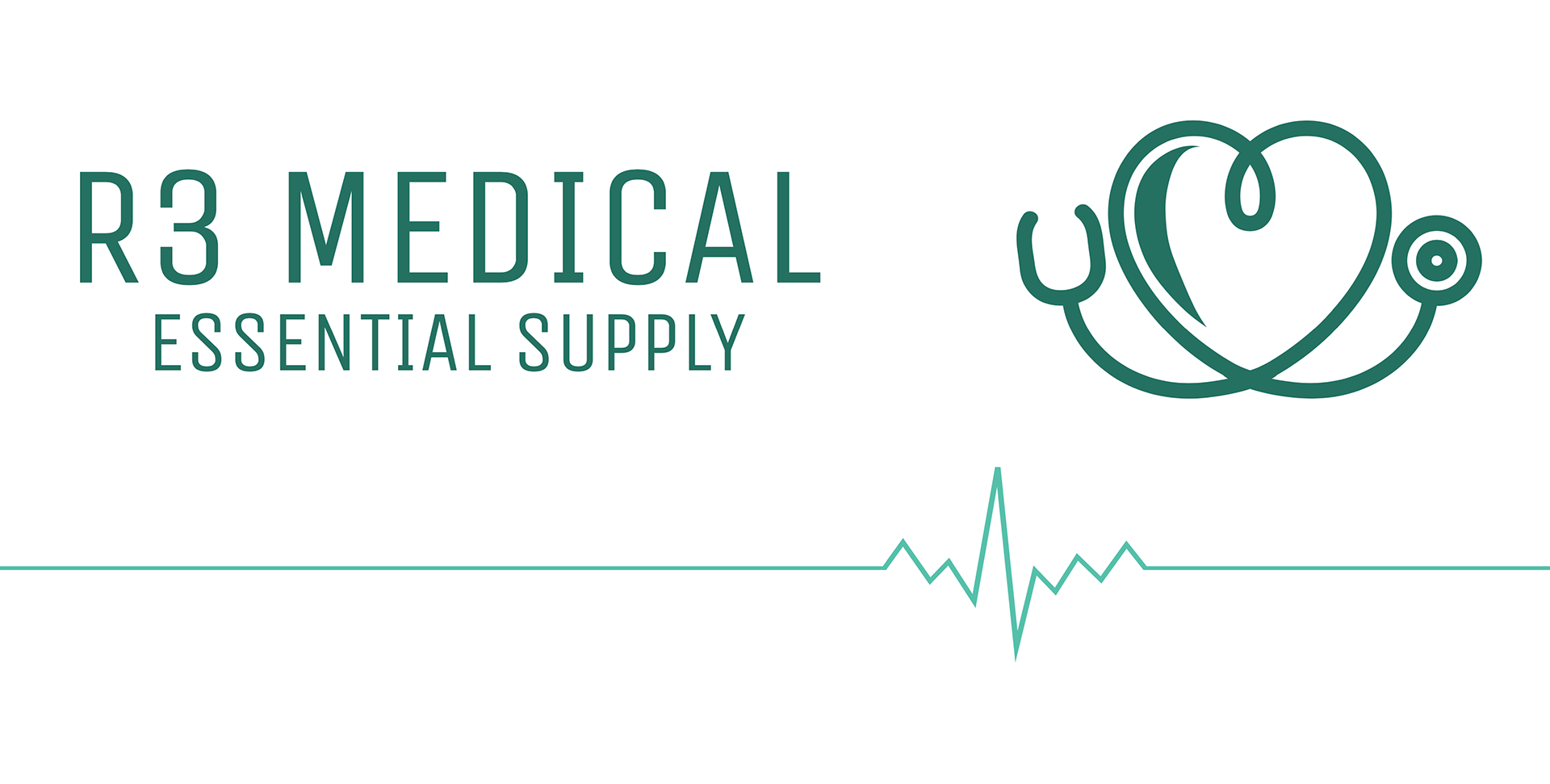
R3 Medical is a medical supply distributor based in Indiana, providing high-quality medical products to schools, businesses, and institutional clients. Their mission is rooted in reliable sourcing, compliance, and community support.
I was brought in to design a clean, trustworthy brand identity that would reflect their professionalism, industry focus, and logistics expertise. From logo development to packaging mockups and client-facing materials, the goal was to establish a strong visual foundation that could grow with the company.
The Process
I started with a deep dive into the company’s service model and buyer relationships. We explored visual cues commonly seen in the medical space — but refined them to avoid cliché or overused aesthetics.
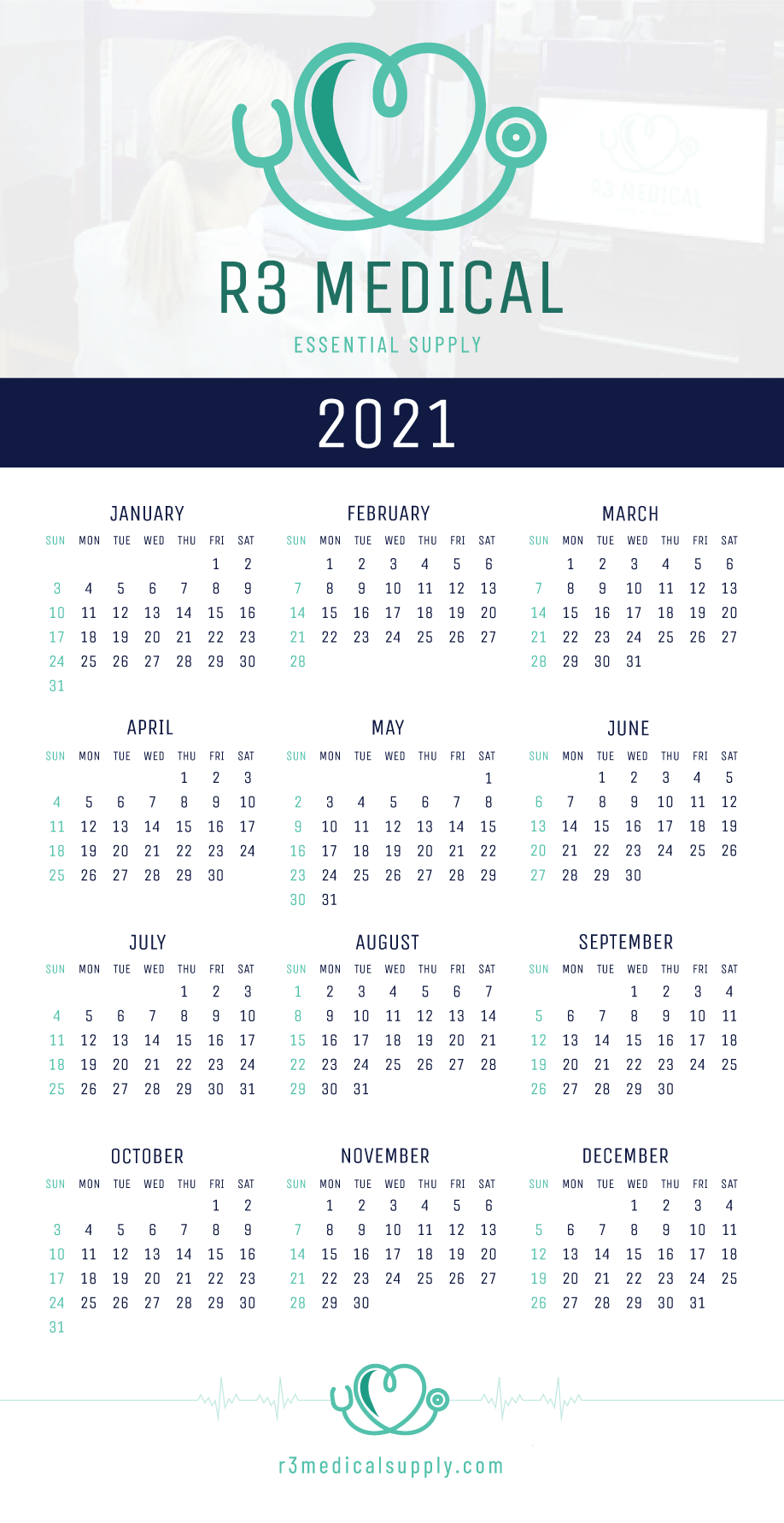
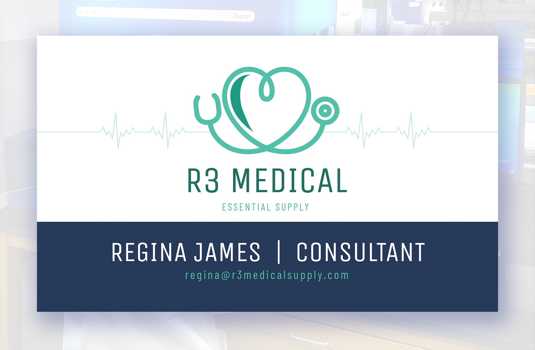
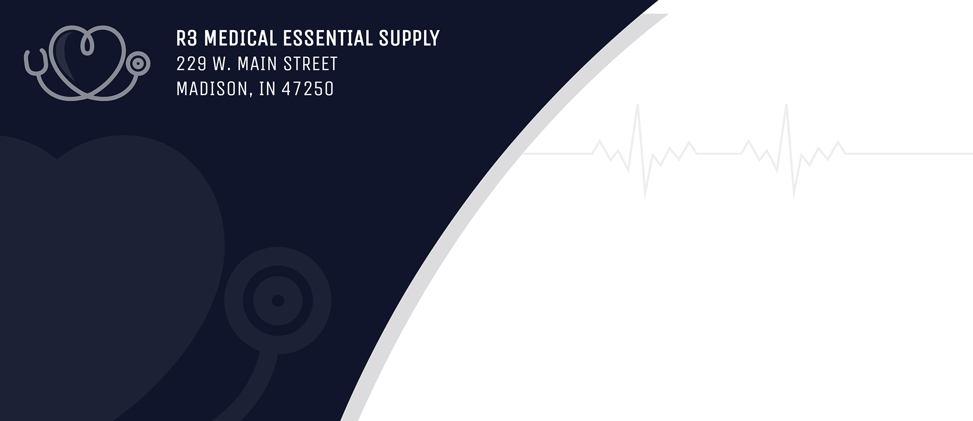
After logo exploration and client alignment, I developed a visual system that included typography, color palette, and simple packaging mockups. I also designed business cards, internal presentation templates, and basic digital layouts for client interactions.
Art Production
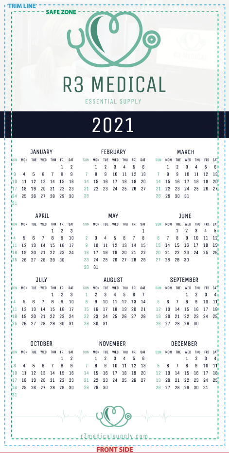
For this project, I used the client's pre-existing color swatch and designated fonts and imported the components into Adobe Illustrator, where I was able to begin preparing the packaging art for this request:
• Utilizing design software (such as Adobe Illustrator and Photoshop), we can create and refine the design.
• Understanding CMYK and RGB color processing is crucial, as we need to ensure the proof (and final, physical product) matches what we're seeing digitally, on-screen.
Editing & Preflight
Before finalizing anything, we want to make sure all artwork is crisp, clean, free of any errors (including spelling, floating files, or brand-specific inconsistencies).
It's also very important to collaborate with others in a committee-based approach, seeking second opinions and editing the design as necessary.
(Key emphasis is placed on having another set of eyes and logic to apply towards finding any room for improvement before finalization).
(Key emphasis is placed on having another set of eyes and logic to apply towards finding any room for improvement before finalization).
Below, I was able to ensure the following:
1. Place all existing design elements into a master template (provided by a verified source), ensuring all ink and colors are properly matched, branding style is consistent, and all design elements are placed properly within the allocated margins.
2. Ensure the mockup art has been seen by others, allowing for ample time on any necessary revisions or additional requests.
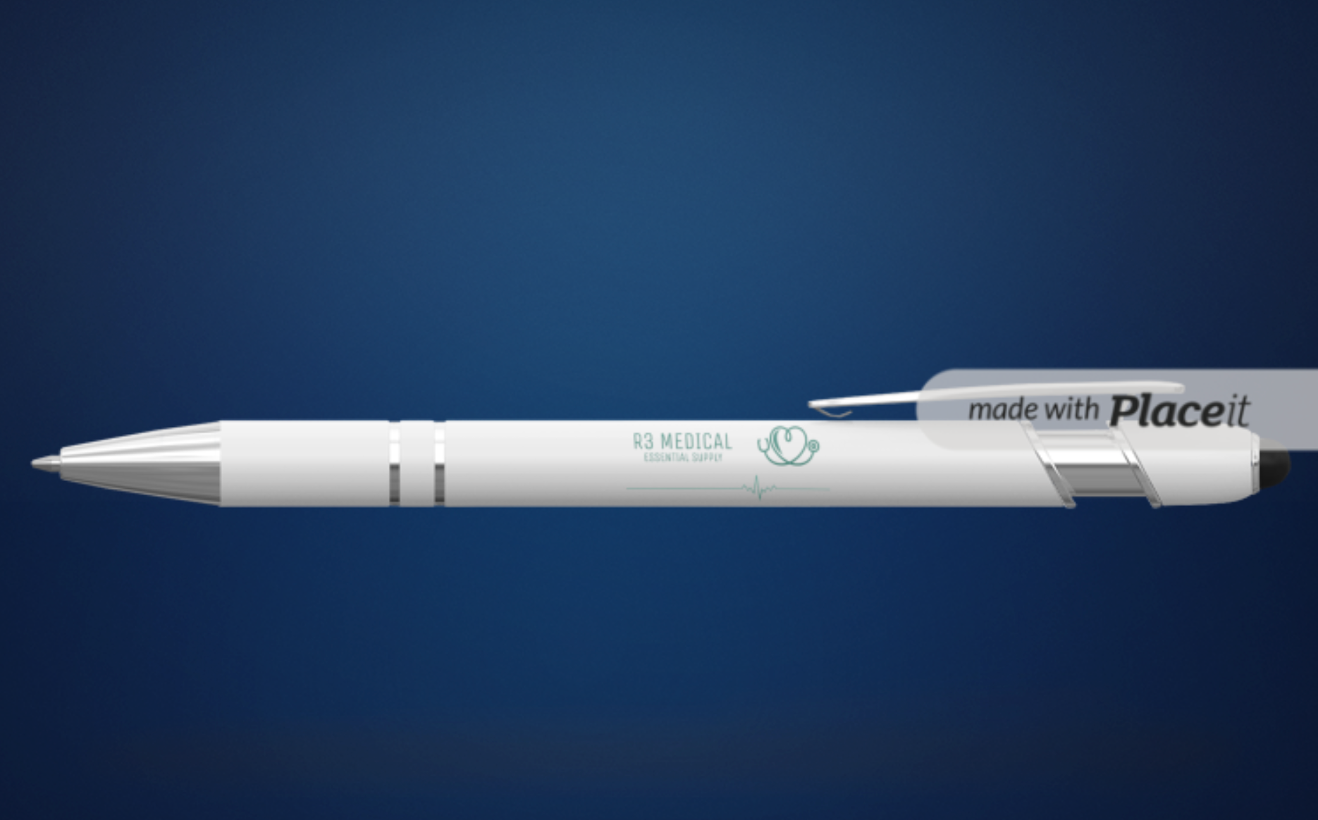
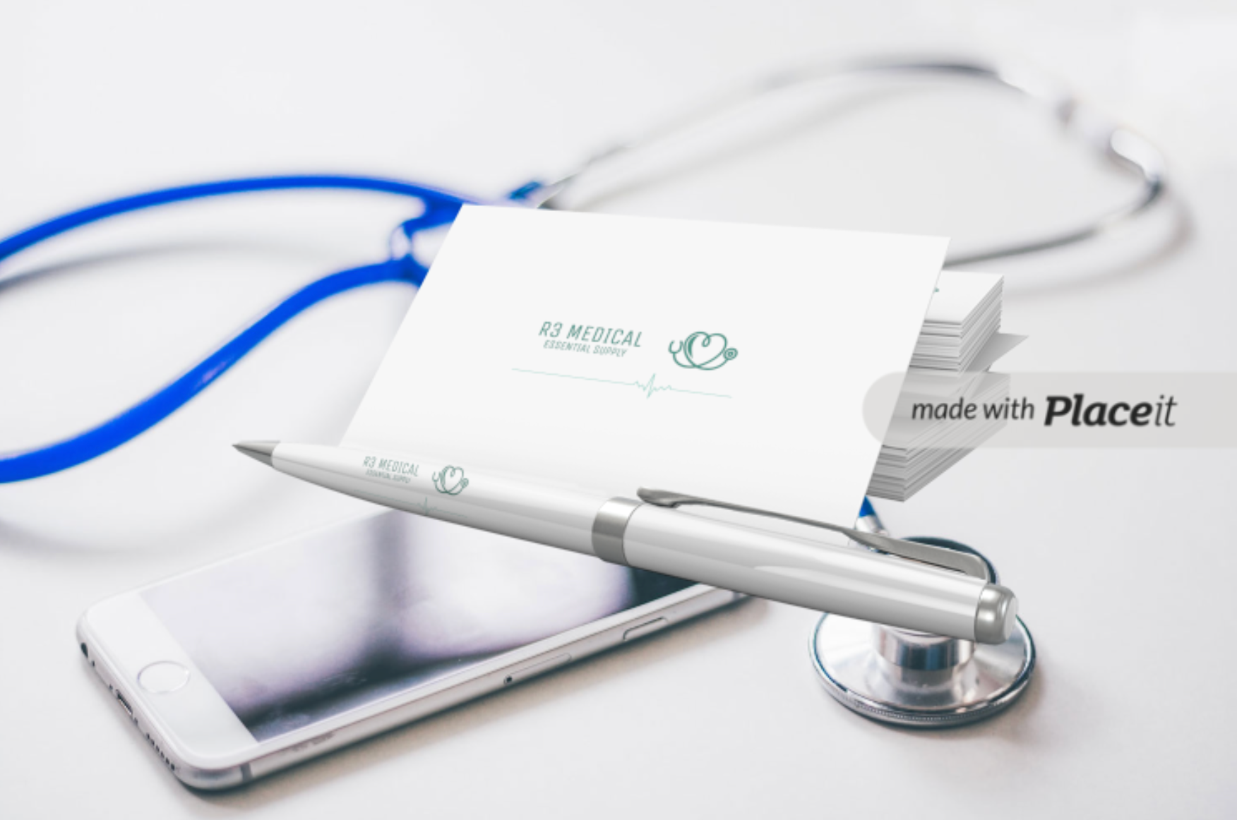
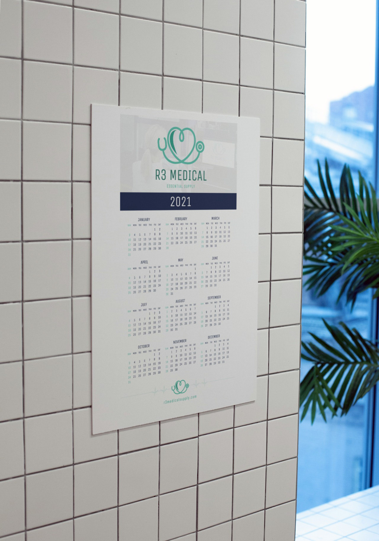
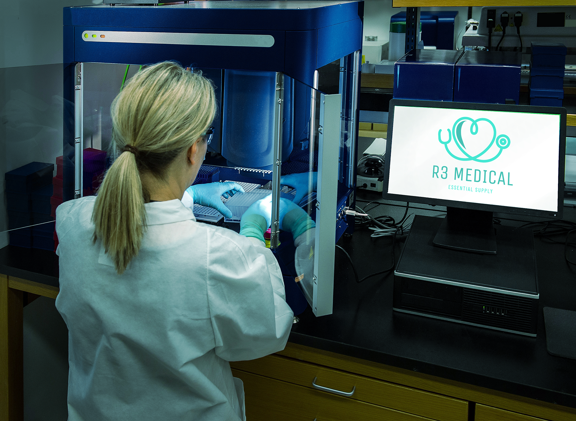
Editorial Placement
I like to create mockups and editorial-style images to help clients envision the final product and understand how it will look in various settings.
If the budget allows, you may also have someone photograph any prototypes. It's also possible to dig deeper into design software to create even more custom renderings. As always, it's great to manage your time efficiently to ensure all print deadlines are met.
For this example, I used a free third-party generator to save time, and ensure the clients vision and overall confidence on the project remained prominent.
Strategical Challenges / Solutions
Visual credibility in a highly regulated space
→ Solution: Built a professional identity rooted in trust and simplicity, avoiding trendy or clinical stereotypes.
→ Solution: Built a professional identity rooted in trust and simplicity, avoiding trendy or clinical stereotypes.
No existing brand assets
→ Solution: Developed an end-to-end visual system including logo, color standards, and scalable layouts.
→ Solution: Developed an end-to-end visual system including logo, color standards, and scalable layouts.
Small business needing enterprise polish
→ Solution: Delivered marketing materials and production-ready templates that present R3 as a serious, vendor-ready operation.
→ Solution: Delivered marketing materials and production-ready templates that present R3 as a serious, vendor-ready operation.
Conclusion
This project gave me the chance to help a small business step into a competitive space with clarity and confidence. From first impression to packaging visuals, the brand identity I built helped R3 Medical look the part — and that visual trust is often the difference in winning contracts in the healthcare industry.
The client loved the mockups and proceeded with the order.
By following these essential steps, I created effective and visually stunning package designs that met the needs of my client, and best-communicate their brand message in a compelling way.


Role: Brand Identity Designer
Tools: Illustrator, Photoshop, InDesign
Client Team: R3 Medical founder + product/ops leads
Tools: Illustrator, Photoshop, InDesign
Client Team: R3 Medical founder + product/ops leads